Fonts

Primary Fonts

About
About

Public Sans is a strong, neutral typeface that is officially endorsed by the United States Web Design System (USWDS), the same organization that developed this font with clarity and accessibility in mind. This highly readable typeface conforms to Section 508 and WCAG guidelines and is part of an open-source project that accepts and addresses accessibility-related feedback from the community to continuously improve this font family.  

Public Sans takes inspiration from geometric sans faces of the 20th century, as well as the original Franklins of the 19th, resulting in a hybrid typeface that retains a distinctly American style. It is open source and licensed under the SIL Open Font License, Version 1.1 Download the font for free

When to use
When to use

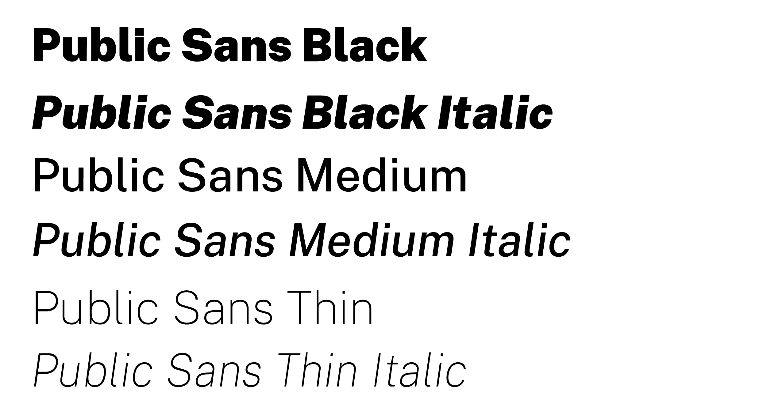
Use Public Sans for headlines, body-copy and interface design, on its own or in conjunction with any of the allowable University fonts listed on this page. This straightforward typeface is available in nine different weights in both Roman and Italic versions and is our most adaptable font option because of its clarity, high-accessibility and neutral design.   

Janson

Examples of: Janson Roman, Janson Bold and Janson Italic
About
About

Janson is a crisp, relatively high-contrast font often used for body text and known for its legibility in print. This classic old-style serif typeface is named after the 17th-centruty printer Anton Janson, though its design is based on the 17th-century work of Hungarian punch-cutter Miklós Tótfalusi Kis.  

Janson is made by the German type foundry, URW, and is available for purchase from font resellers T26 or MyFonts.com.

When to use
When to use

Use Janson for long-form, printed body text in formal documents, advertising, annual reports, magazines and other similar contexts. Its high readability and classic, old-style serif design will give your piece an authoritative and professional feel.  

Trajan Pro

Examples of: Trajan Pro and Trajan Pro Bold
About
About

Trajan is an all-caps, classic serif typeface known for its elegant and historical feel. Designed by Carol Twombly for Adobe in 1989, it is based on the capital letters of ancient Roman inscriptions found on the base of the Trajan's Column in Rome.  

When to use
When to use

At UAlbany, Trajan is used only for our formal institutional mark and the identification marks for each of our schools and colleges, individual offices and University divisions.

The use of Trajan is restricted to the Office of Communications and Marketing only. If you wish to use Trajan for a special purpose, please submit a request form.

Web Fonts

Public Sans

Sample of Public Sans Extra Light Font
About
About

A strong, neutral typeface for interfaces, text, and headings that was developed by the United States Web Design System (USWDS) specifically with clarity and accessibility in mind, making it highly suitable for use in accessible PDFs and other digital documents. It is officially endorsed by the USWDS and used by various government agencies (e.g., USDA, NIAID, NSW Digital) as a readable typeface that conforms to Section 508 requirements and WCAG guidelines. 

The font is part of an open-source project with a focus on continuous improvement, including addressing accessibility-related feedback from the community.  It takes inspiration from geometric sans faces of the 20th century, as well as the original Franklins of the 19th, resulting in a hybrid typeface that retains a distinctly American style. Public Sans type is open source and is licensed under the SIL Open Font License, Version 1.1  Download Public Sans

When to use
When to use

Use Public Sans Extra Light for body-copy and interface design, on its own or in conjunction with Oswald Medium 500. This straightforward typeface is available in nine different weights in both Roman and Italic versions and is our most adaptable font option because of its clarity, high-accessibility and neutral design.   

Oswald

Sample of Oswald Medium 500
About
About

Oswald is a popular, free, open-source sans-serif font, a digital adaptation of classic gothic/grotesque typefaces (like Alternate Gothic), designed by Vernon Adams for clear readability on screens. Known for its bold, strong and defined look, it's versatile for web, print and branding, offering various weights and excellent multilingual support, making it a go-to for modern digital design. Download Oswald

When to use
When to use

Oswald is used exclusively for headings h1 through h6. Use Oswald Medium 500 to maintain a strong, clean and modern visual hierarchy across all page headings. Download Oswald.

Athletics Fonts

United Sans

Samples of the font United Sans, used on the Athletics website.
About
About

This is a sans-serif font family designed by House Industries that is inspired by U.S. military lettering styles. It is known for its versatility, coming in a wide range of widths (condensed, semi-condensed, regular, semi-extended, extended) and weights (thin, light, medium, bold, black). The font is used by various organizations for branding, including the University of Oregon, Purdue University, and United Airlines.  It is available for purchase from House Industries.

When to use

Furore

Furore Font Sample
About
About

This font is a bold, industrial sans-serif font designed by Daniel Vorobyov and Ivan Gladkikh that is free for commercial use. It is characterized by its strong, clean lines and is well-suited for headlines, logos, and display purposes like posters, sports branding, and signage. The font includes all caps letters, numbers, and symbols, and supports both Latin and Cyrillic languages. Its use is restricted to Athletics and Athletics related branding.

When to use