Risk Communication Experts Analyze Visual Responses to Tornado Warning Graphics

ALBANY, N.Y. (Feb. 25, 2021) – According to the National Weather Service, the average lead time for a tornado warning is now up to 13 minutes nationally, a significant improvement from the 1980s when the average was just five minutes.
But, as researchers continue to better understand tornado development and improve lead times even more, University at Albany risk communication expert Jeannette Sutton is focused on another critical aspect of twister preparedness and resiliency – the effectiveness of visual warning graphics.
In a new analysis, Sutton, an associate professor at the College of Emergency Preparedness, Homeland Security and Cybersecurity, and her co-author Laura Fischer of Texas Tech University, used a combination of eye-tracking methods and “think aloud” interviews to investigate what visual features attract attention and/or cue a call to action around an emerging tornado threat.
Their findings were published in the Journal of Weather, Climate and Society of the American Meteorological Society.
“Tornadoes frequently pose an imminent threat to individuals, requiring quick decision-making and protective actions,” Sutton said. “To date, many researchers have investigated how people perceive and respond behaviorally to warning messages. However, limited research has addressed how people allocate attention to messages, that is, what they actively look at, and how the attributes of warning messages influence attention.”
Visual Tornado Risk

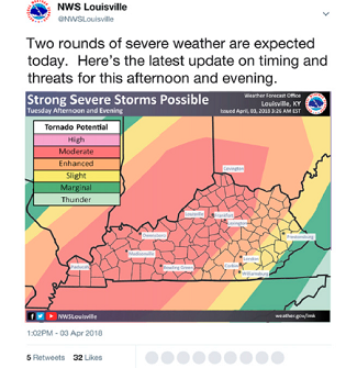
Eye-tracking data for the analysis was collected from a sample of 171 undergraduates at a large southeastern university. Participants were invited to view a series of tweets that depict a progressing tornado threat, all of which were previously shared by the National Weather Service. A Tobii TX300 eye-tracker control unit was located just below the screen to monitor viewing patterns. The group also completed a post-test questionnaire.
For “think aloud” interviews, 20 graduate students recruited from the same university were asked to describe their thoughts and reactions as they viewed the same series of tornado messaging as the first group.
Their analysis revealed several key findings and trends. Notably, colors, such as green, yellow and red represent a learned scheme of increasing levels of risk. The use of unfamiliar colors to depict extreme risk, such as purple, can lead to confusion and requires more public education. Inclusion of multiple colors/scales on a single graphic without adequate labeling can also lead to confusion.
Careful consideration about the design and presentation of the text is also important. For example, the use of signal words, such as “warning,” displayed in all capital letters helps them stand out from the rest of the graphic. Adding a direct call to action also helps individuals who are unfamiliar with tornado threats determine what to do.
“By taking into consideration the careful design and presentation of visual risk information, risk communicators have the opportunity to reduce confusion and increase understanding about an emerging threat among populations at risk,” Sutton said. “This has the potential to lead to better outcomes for risk messaging and protective action responses in the future.”
Research for their analysis was supported by the National Oceanic and Atmospheric Administration (NOAA).


